Finance Decision Experience
Led the design direction for Nissan's customer finance journey at a high-intent point in vehicle purchase, helping customers understand affordability, make sense of the financial commitment and decide what to do next.
I led the design direction for a high-consideration moment in the vehicle purchase journey: when customers stop exploring cars and start deciding whether a specific vehicle is affordable. I led the exploration of two genuinely different concepts and took both into testing. The research report recommended Direction B, but the evidence underneath it was more nuanced. I used that evidence to shape a synthesis that became the product direction, then stayed with it through refinement, validation and delivery.
TL;DR
A finance calculator was the artefact. The real problem was helping a customer work out whether they could afford the car in front of them, and what to do next.
The direction taken forward
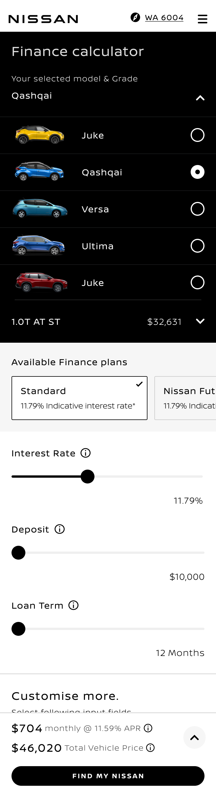
Vehicle context
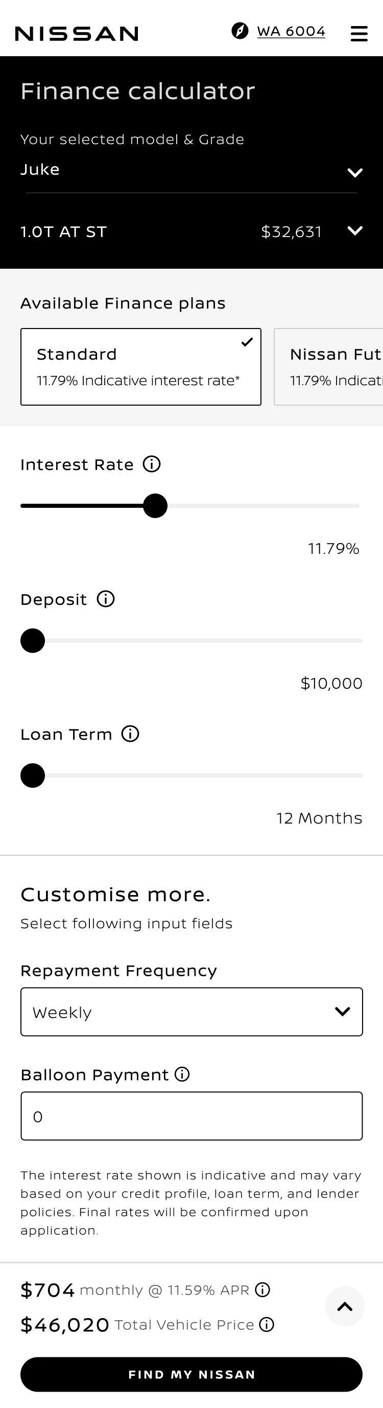
Finance configuration
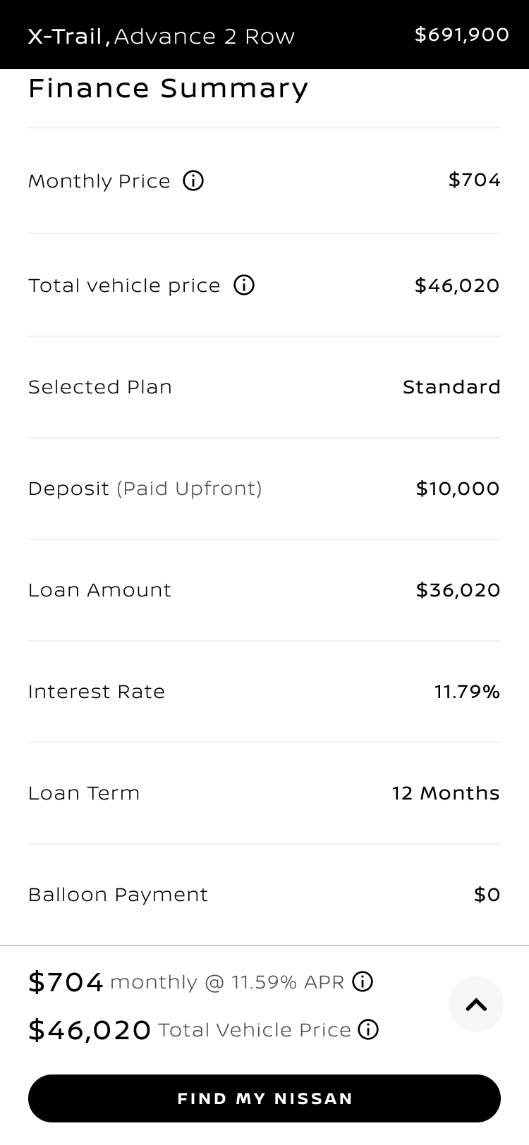
Decision summary
The decision journey
- 01 ENTRYEntry pointsListing · model page · detail page · configurator · campaign
- 02 INPUTSFinance inputsPlan · deposit · term · rate
- 03 SIGNALRepaymentThe affordability answer
- 04 SUMMARYFinance summaryTotal cost · plan · breakdown
- 05 ACTIONNext stepSave · quote · continue
Not a calculator screen. A five-step decision sequence a customer moves through while deciding whether a vehicle is affordable and whether to go further.
Not a calculator. A purchase decision.
The artefact was a finance calculator. The experience was the moment a high-consideration purchase becomes a financial commitment. Customers arrived from listing pages, model pages, the configurator and paid campaigns, and they all wanted the same four things answered before they would go any further.
AFFORD
Can I afford this vehicle?
The monthly or weekly figure, and what moves it.
UNDERSTAND
What will it actually cost me?
Total cost, deposit, term, rate and what the plan does at the end.
COMPARE
How do my options compare?
Across grades, plans and terms, without leaving the page.
PROGRESS
What should I do next?
Save it, share it, or take it to a dealer.
That places the experience at a commercially significant point in the purchase journey: between product interest and a customer's decision about whether and how to progress. Market research the business held at the time showed substantial uncertainty around choosing a suitable finance option and understanding the terms being offered. The calculator was where that uncertainty either resolved or ended the journey.
Product analytics described the friction in the existing flow, and journey mapping, competitive review and heuristic analysis described its shape. None of them said what to build.
Where customers arrived from
- 01 BROWSEBrowsing intent
- Homepage
- Model listing
- Offers and promotions
- 02 MODELModel intent
- Model landing page
- Product detail page
- Configurator
- 03 FINANCEFinance intent
- Finance content
- Campaign landing
- Direct calculator entry
- 04 ACTIONDecision action
- Finance summary
- Save or share result
- Quote or dealer handoff
Customers reached the same finance moment carrying very different amounts of context. A large share arrived from campaigns rather than from inside the product journey, while the pages where purchase intent was highest carried no route into finance at all.
Baseline the design answered to
Product analytics described the friction, not the fix
Significant fallout
Fallout at the vehicle step, and again between vehicle and version
Material drop
Drop in mobile scroll coverage, with disclaimers lengthening the page
9 fields
At the summary step, with engagement declining further down the list
Pre-design baseline context. These figures framed the problem and are not presented as a measure of what the design later changed.
Setting the design direction
I was the Design Manager and design lead on this work. I framed the design problem, set the experience direction and interaction priorities, guided the designers through exploration and refinement, and shaped the UX and parts of the UI myself. An external agency ran the usability study and delivered a report with a recommendation. I interpreted the findings, decided what they meant for the product, and authored the recommendation that took the work forward.
I worked across the Product Owner, the research agency, the design team and an external delivery partner, holding the direction steady as it moved between them. My ownership did not stop at the recommendation. I stayed with the direction through refinement and delivery, reviewing interaction quality, design-system alignment and whether the implemented experience still preserved the decision hierarchy it was built around.
- Frame the problem
- Set the direction
- Make the call
- Take it through delivery
Defined the direction
Set the experience direction, the interaction priorities and the criteria the design had to satisfy.
Translated the evidence
Turned usability findings, journey mapping and the analytics baseline into concrete product design decisions.
Owned the recommendation
Made and argued the call on which direction to take forward, and what to carry into it from the one not selected.
Held quality to delivery
Guided refinement, validated interaction and design-system behaviour, and kept the design intent intact through to the live journey.
Designing for financial comprehension
Finance interfaces fail in a specific way. The arithmetic is easy and the comprehension is hard. A customer can see a number without knowing what produced it, what it commits them to, or how it compares to the alternative they were considering a minute ago. Four jobs had to happen inside one screen, and on mobile they had to happen inside one column.
The hardest of these was hierarchy. Every element that helped one job competed for the space another needed: vehicle imagery built confidence but pushed the summary down; more inputs gave control but lengthened the page; disclaimers were non-negotiable but were measurably costing mobile scroll depth. Deciding what deserved permanent space, what earned a scroll and what belonged behind a deliberate second step was the core interaction design work.
Four jobs in one screen
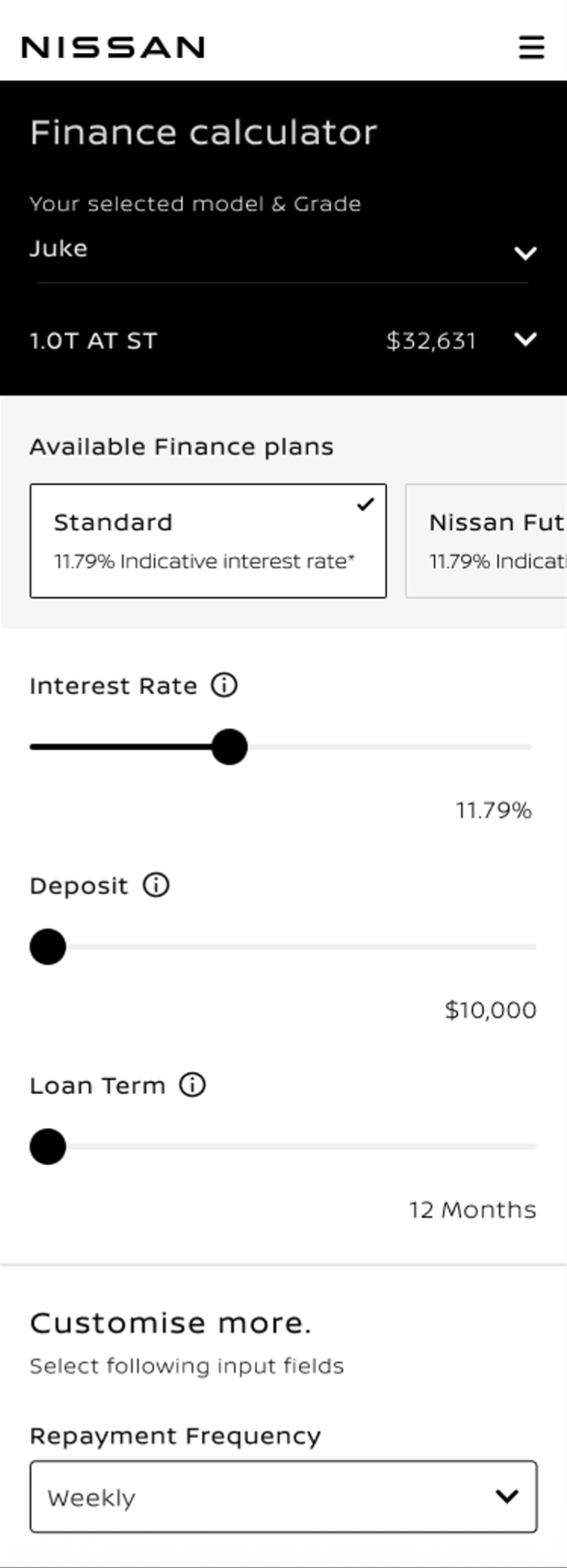
Screen order
What earns permanent space, what earns a scroll
- 01Vehicle contextModel, grade and price, compressed to a persistent bar.Confidence
- 02Selection and plansOptions priced at the point of choice; plans set side by side.Comparison
- 03Primary inputsRate, deposit and term, each with its explanation attached.Comprehension
- 04RepaymentHeld with the inputs, so every adjustment answers the question.Affordability
- 05Finance summaryInline after the inputs, reached by scrolling.Progression
- 06Forward actionSave, share, or take the result to a dealer.Progression
Reading down the screen is reading down the customer's reasoning. The two marked rows are what the whole direction exists to protect.
Two credible directions
Rather than refine a single concept, I took two genuinely different strategies into testing. Direction A treated the finance moment as part of shopping and kept the vehicle in view. Direction B treated it as a decision the customer had already committed to, compressed the selection and gave the reasoning more room.
Both were defensible. Each optimised for a different customer at a different point of certainty, and each paid a real cost for the thing it optimised. Testing them against each other was how the trade-off became visible instead of theoretical.
Two legitimate strategies
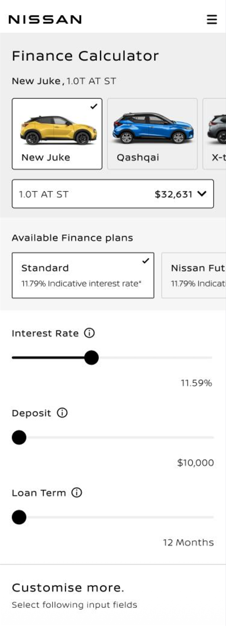
Top of the mobile screen, image-led model selection.
DIRECTION A
Lead with the vehicle
Treat the finance moment as part of shopping. Keep the car visible and let people change their mind about it.
- Vehicle imagery supported browsing and visualisation
- Model choice felt tangible for undecided customers
- Cost: the summary sat behind an expandable panel
- Cost: visual selection consumed scarce mobile height
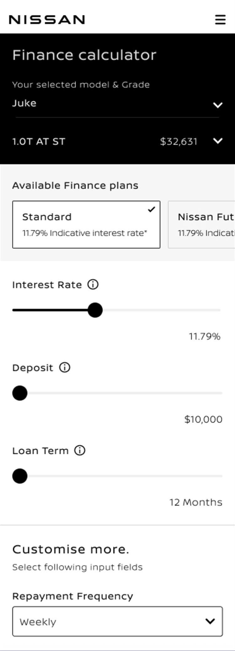
Top of the mobile screen, compact selection header.
DIRECTION B
Lead with the decision
Treat the finance moment as a calculation the customer has already committed to. Compress selection, expose the reasoning.
- Everything on one page, with fewer sub-menus
- Summary sat inline after the inputs and was easier to reach
- Stronger as a mobile finance flow
- Cost: dropdown selection removed the vehicle from view
Interface difference to design implication
Three differences that actually mattered
Finding the finance summary
Direction A
Behind an expandable panel at the end of the page
Direction B
Inline, directly after the finance inputs
80% found it first time in B against 60% in A; ease of finding 4.68 against 3.64
Make the summary structurally discoverable instead of asking customers to reveal it
Keeping the vehicle present
Direction A
Image-led model selection at the top of the screen
Direction B
Compact selection header with no vehicle imagery
36% preferred A for clearer car images and easier selection; B users asked for more visual engagement
Keep vehicle identity, at a size that does not push the decision down the page
Moving through the decision
Direction A
More screens and panels to move between
Direction B
One page, fewer sub-menus
Ease of use 4.2 against 3.68; the 64% preference cited layout, navigation and mobile
Take the single-page decision structure as the foundation
Neither direction was wrong. They optimised for different customers at different points of certainty, and each paid a real price for what it optimised.
Research gave us signals, not the answer
The agency ran an unmoderated mixed-methods study with 25 participants who had bought a car in the previous three years and had used an online finance calculator before. Direction B performed better on preference, ease of use and, most importantly, on whether people could find the finance summary at all.
Preference alone was not enough to make the product decision. A 64/36 split is a direction, not a mandate. The more useful evidence was underneath it: why the 36% preferred A, where B performed materially better, and the fact that participants who preferred B were themselves asking for something B had removed.
Evidence, and what it meant
64%A 36%
preferred Direction B
For clearer layout, easier navigation and easier access to the finance summary, particularly on mobile.
4.2A 3.68
ease of use, out of 5
Direction B scored higher on the overall ease of using the calculator.
80%A 60%
found the summary first time
First-attempt success at locating the finance summary, with ease of finding at 4.68 against 3.64.
4.44both designs
ease of understanding the summary
Once customers reached the summary, they understood it. Findability, not comprehension, was the summary's weak point.
Signal to design implication
Every finding had to earn a design consequence
- 64% preferred Direction BA directional signal about the whole experience, not a mandate to ship that screen
- Summary understood at 4.44 in both designsDo not redesign the summary content. Fix where it sits
- A's vehicle imagery helped people visualise and chooseA real confidence quality to carry forward, not a rejected option
- B users asked for more visual engagementThe 64% majority was itself asking for something the minority direction had
- Plan confusion was the top comprehension themeExplanation belongs against the control, in both directions
Research evidence used to frame the design decision. No post-launch or commercial outcome is claimed from these figures.
The decision: synthesis over voting
I was not looking for a winning prototype. I was looking for the strongest product direction.
The research report recommended Direction B, and the Product Owner's position was to take it forward. I asked us to hold the decision before we committed to it, because the same study showed clear strengths in Direction A that B had removed.
Direction B gave us the stronger decision structure: one page, fewer sub-menus, a summary positioned where the reasoning ended, and an interaction model that held up better on mobile.
Direction A revealed something the overall preference did not fully capture. Vehicle imagery and context made the choice more tangible and helped customers stay oriented, and even participants who preferred Direction B asked for more of that context back.
I recommended Direction B as the structural foundation, while carrying the strongest contextual elements from A into the final experience.
I documented the reasoning in a short presentation: where B had performed better, where it had not, and what combining the strongest parts of both directions could achieve.
The Product Owner agreed with the synthesis, and the external agency was comfortable with the direction once the combined solution was shown.
The recommendation changed the delivered experience. The persistent vehicle context in the live journey came from Direction A; it would not have been there if we had followed the report's recommendation unchanged.
The recommendation
- One page, fewer sub-menus
- Summary inline after the inputs
- Mobile-first interaction model
- Compact selection that protects vertical space
- The vehicle stays present while finance changes
- Model and grade remain tangible choices
- Visual context for customers still deciding
- Warmth in a moment that is otherwise arithmetic
Recommended direction
Direction B as the structural foundation, carrying Direction A's confidence cues
- Decision structure and summary placement from B
- Persistent vehicle context and tangible choice from A
- Explanation held against every finance control
- Flexible enough to survive different market finance products
Turning the direction into a coherent experience
A recommendation is only as good as the interaction decisions that carry it. Four decisions did most of the work, and each resolves a specific tension the evidence had exposed rather than expressing a preference.
Direction into interface
01
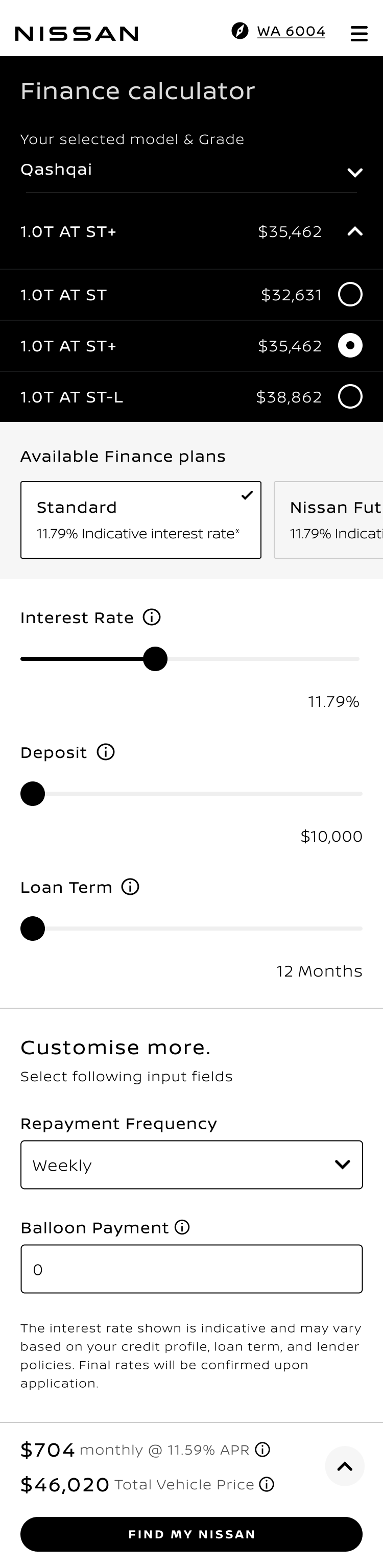
Make affordability persistent
The repayment figure and total cost stay anchored with the inputs rather than waiting at the end of a form. Every adjustment answers the customer's question in the same breath they ask it.
Affordability was the question customers came to ask.
02
Make the summary part of the flow
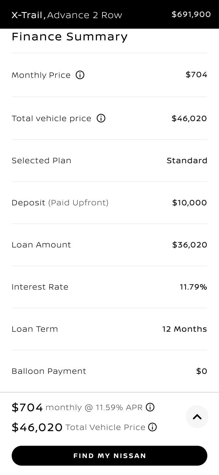
The finance summary moved out of an expandable panel and into the page, directly after the inputs, so placement follows the order the customer reasons in rather than hiding the conclusion behind a discovery step.
First-attempt findability 80% against 60%; customers preferred scrolling to expandable panels.
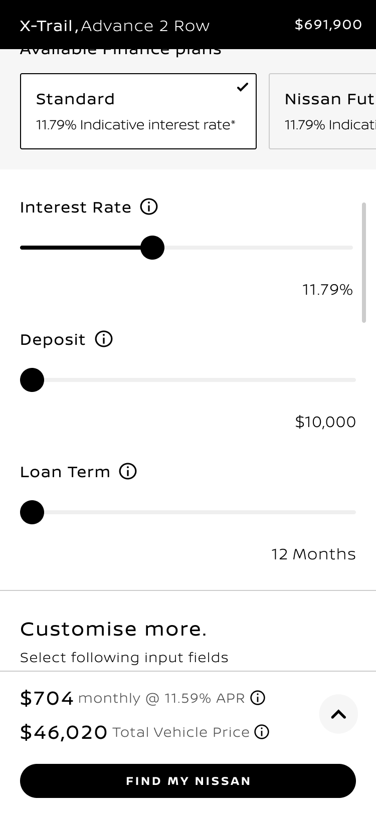
Persistent signal
Expanded summary
03
Explain finance at the point of decision
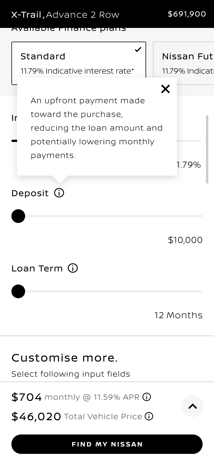
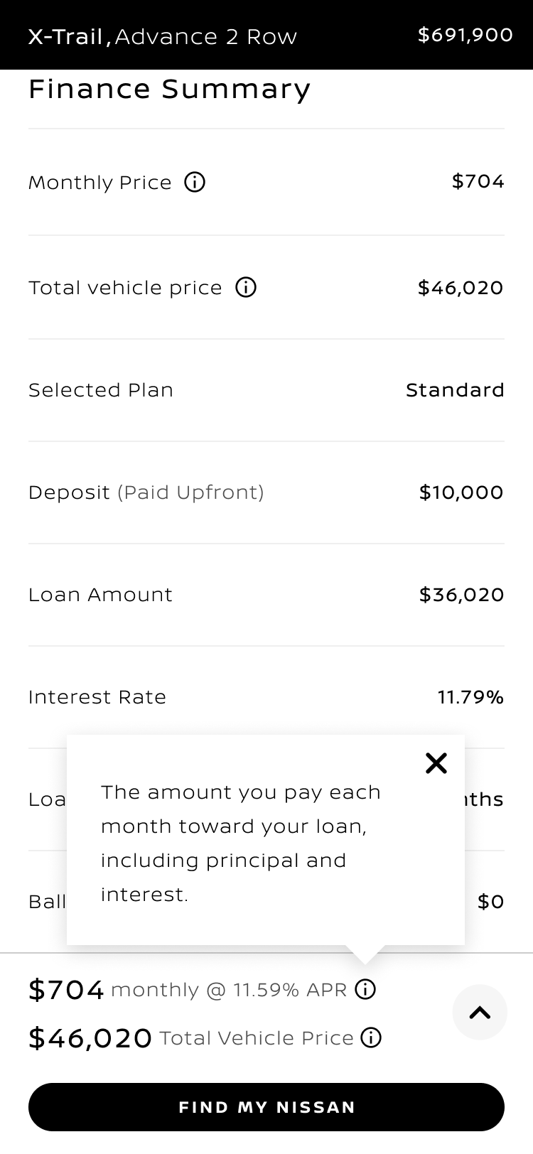
Interest rate, deposit, term, repayment and total price each carry an inline explanation at the control itself, in plain language. Plans sit side by side with their indicative rates, so choosing between them is a comparison rather than a hidden setting.
Understanding the summary scored 4.44 out of 5, with the information affordances named as the reason; plan confusion was the strongest comprehension theme.
Deposit
Repayment
04
Preserve vehicle confidence without competing with finance
The model, grade and price stay present as the customer moves into finance, with grade options priced at the point of choice, rebuilt as a compact persistent bar rather than the image block that had been costing the decision its vertical space.
Carried from Direction A because customers used the vehicle to orient; sized for Direction B because mobile scroll depth was a hard constraint.
05
Progressive input disclosure
Three primary inputs resolve affordability first; secondary parameters such as repayment frequency sit behind a deliberate further step.
Nine fields at the summary step, with engagement declining further down the list.
06
Grade priced at the point of choice
Each grade carries its own price inside the selector, so the cost consequence of trading up is visible without leaving the calculator.
Significant fallout between the vehicle and version steps in the baseline.
07
A single forward action
Save, share or take the result to a dealer stays available with the summary rather than appearing only at the end of the page.
Customers asked to save, email or print the result.
Leading through delivery
The finance experience was designed as a multi-market product direction rather than a single-market UI. It moved into delivery across Europe, Latin America, APAC and the Middle East.
Finance products, trade-in capability, comparison features and regulatory presentation rules varied by market, so the direction had to behave as a framework rather than a fixed screen. I separated what the customer decision model required everywhere from what each market could adapt, keeping the core reasoning stable while allowing local products, terminology and capabilities to change.
What travels, what adapts
- 01Repayment visible against the inputs
- 02Summary inline and findable
- 03Explanation at the point of use
- 04A saveable, shareable result
- 05Mobile-first hierarchy
- 06Design-system components and behaviour
- 01Available finance products and plan names
- 02Comparison and trade-in capability
- 03Quote, dealer and pre-approval actions
- 04Regulatory presentation of rates and costs
- 05Local terminology
- 06Campaign and entry-point mix
The goal was never identical global UI. It was the same decision clarity surviving contact with different finance products and different regulation.
From there the work moved through refinement, design-system validation and delivery collaboration with the external partner. I reviewed interaction quality, component and responsive behaviour and design-system application, and checked the thing that mattered most in a long delivery: whether the built experience still led with affordability, kept the summary findable and preserved the decision model as market adaptations were introduced.
From recommendation to production
- 01Direction set
- 02Guided refinement
- 03Design-system validation
- 04Delivery collaboration
- 05Live customer journey
Not a handoff. The same person who set the direction reviewed whether the built experience still behaved like it.
Hierarchy
Did the built experience still lead with repayment and keep the summary findable?
Components
Inputs, sliders, selectors, information affordances and summary panels against design-system behaviour.
Responsive behaviour
Mobile scroll depth, touch targets, text resizing and summary access on small screens.
Decision model
Whether market adaptation had quietly broken the reasoning order the direction depended on.
What changed
The recommended direction progressed through refinement, design-system validation and implementation into the live Nissan finance journey.
PRODUCT DIRECTION
A stronger product direction
The research report recommended Direction B. What went forward was Direction B as the structural foundation, carrying the strongest elements of Direction A into it.
PRODUCT CONSEQUENCE
The recommendation reached the product
The persistent vehicle context and other qualities carried across from Direction A are visible in the delivered experience because of that synthesis rather than the report's original recommendation alone.
DELIVERY
From direction to live delivery
I stayed with the work through refinement, design-system validation and implementation with Product, Design and the external delivery partner, helping preserve the customer decision model as the experience moved into production across multiple markets and regions.