Beauty Client Card
Turning a safety-sensitive practitioner workflow into a working product.
A practitioner was running a safety-sensitive workflow on paper. I identified the problem, defined the product, decided what not to build, designed the workflow and the interface, set the rules the software would enforce, directed the implementation, audited it before anyone relied on it, and took it into real use.
TL;DR
The design problem wasn't digitising the workflow. It was deciding where software should take control, and where practitioner judgement should remain.
The product in use
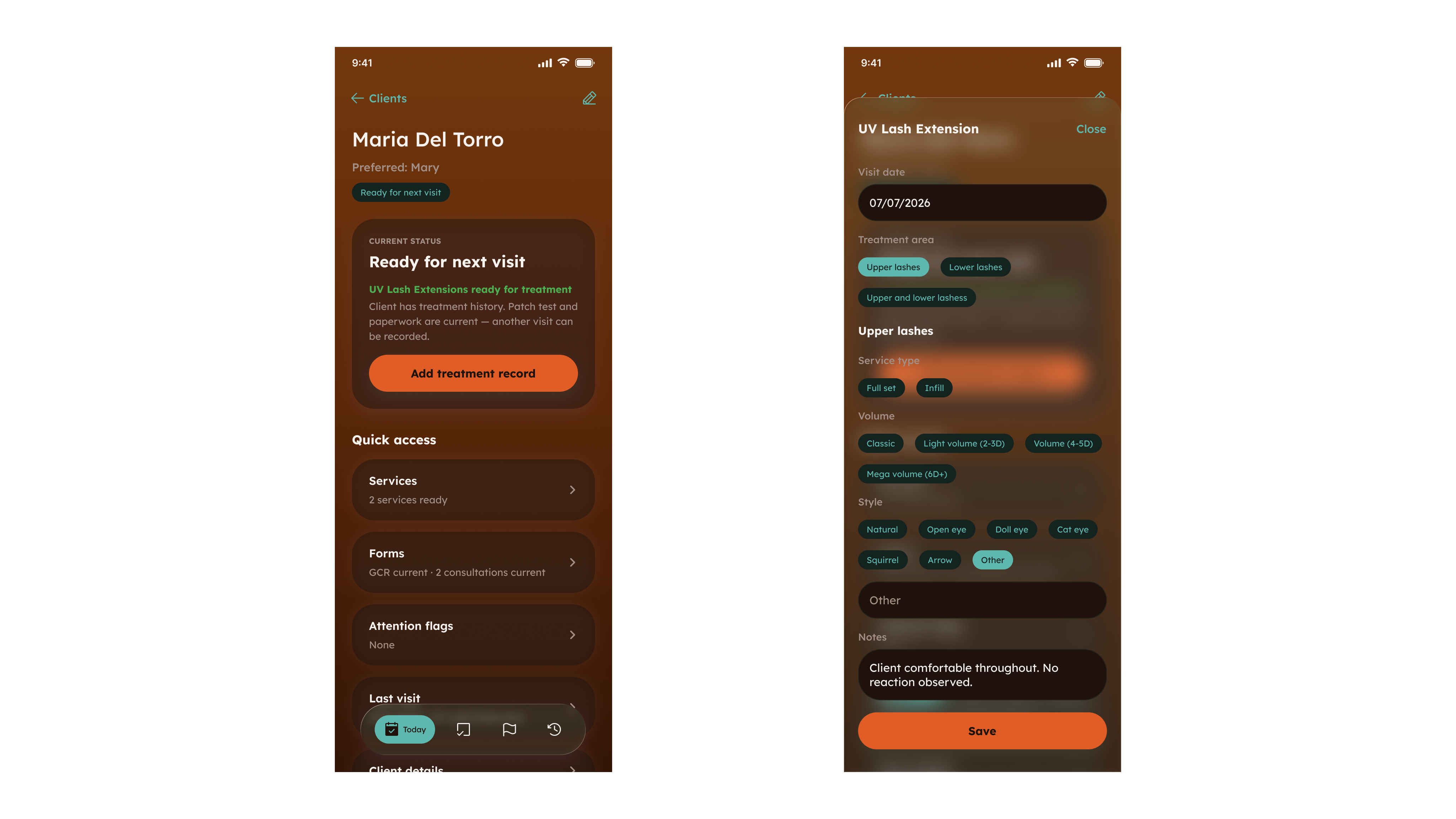
Beauty Client Card is a mobile-first operational product used on a phone between clients and on a tablet in front of them. The practitioner opens a client, sees the one thing that needs attention, resolves it, and records the treatment.
Everything that follows is a decision about that sequence.
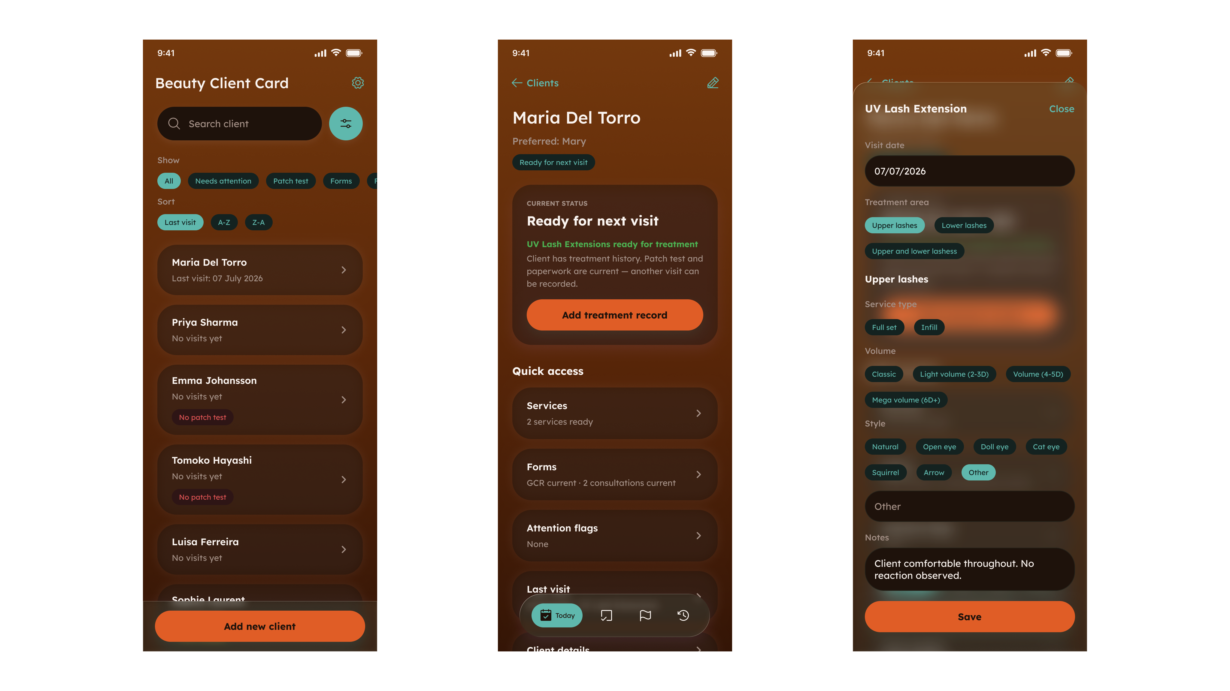
The problem was not paper. It was the decision.
A paper client card is a competent filing system. It stores what a client declared, what was tested and what was done. What it cannot do is answer the question that opens every appointment: can this treatment go ahead right now, and what should I look at first?
That answer lived in the practitioner's memory and in the physical act of reconstructing it from a folder: which patch test covered which service, whether anything had been declared since, which of last visit's details should carry forward. Every one of those is a place where a busy day quietly degrades a safety decision. Digitising the forms would have preserved that exactly: the same information, faster to file, with the decision still unmodelled.
I deliberately did not build a CRM.
The first product decision was subtraction. One practitioner did not need booking, payments, deposits, marketing automation, a client portal or a configurable form builder. Each is defensible alone and fatal together: they turn a workflow that has to be fast between clients into software that needs administering, and every one of them competes for attention at exactly the wrong moment.
Scope stayed on client evidence, eligibility, treatment records and repeat visits, and stayed there under pressure, because a product like this attracts adjacent features continuously.
Where should software take control?
Every rule had to be sorted into one of three categories, and getting that sorting wrong in either direction breaks the product. Too little control and the software is a filing cabinet with a login. Too much and it starts overruling a trained professional on questions it has no basis to judge, which does not make anyone safer, it teaches the practitioner to work around the system.
I drew the line between a procedural requirement and a professional judgement.
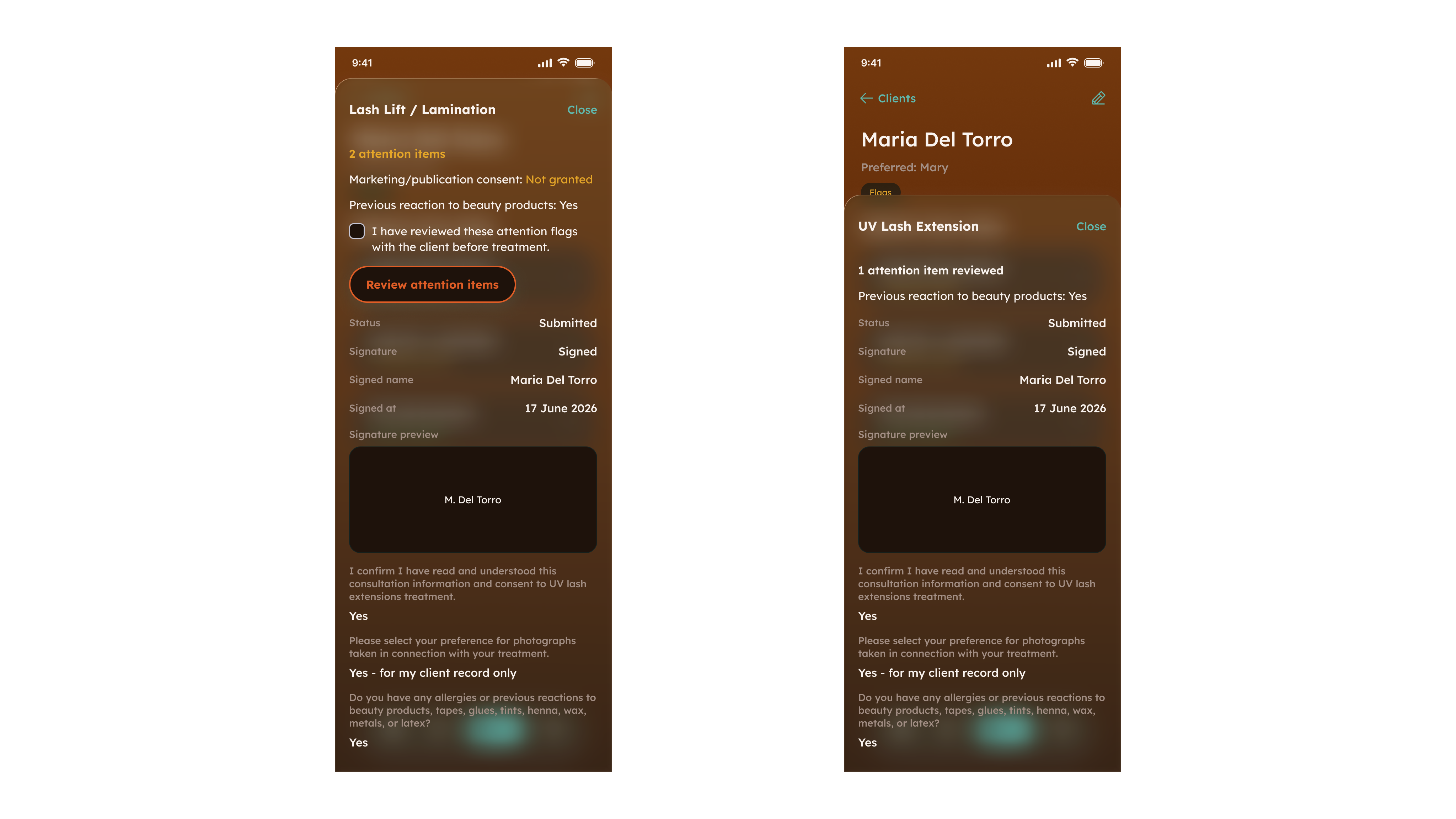
An early practitioner session settled this. The earlier model produced false blocks: situations where software stopped progression based on a signal that was meant to inform practitioner judgement, not replace it. The evidence was unambiguous: a system that blocks on those signals is not stricter, it is worked around. Acknowledgement recorded against a specific signed submission gives the practitioner the prompt without taking the decision.
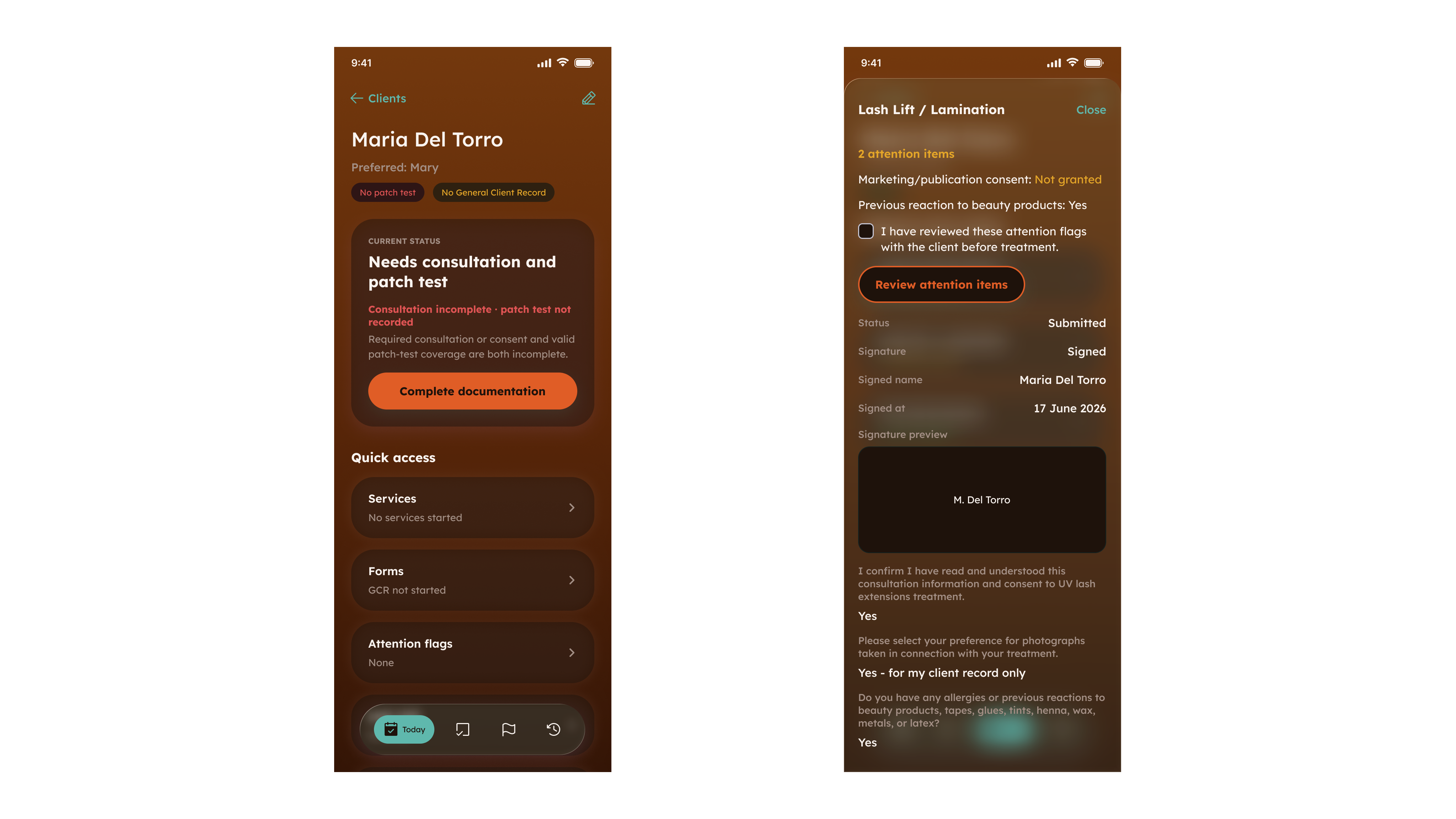
The interface should never claim more than the evidence supports
Two decisions came out of the same principle.
Eligibility belongs to a service, not a client
The first model held one patch-test verdict per client: valid, expired or missing. Simple, visible on every screen, and false. Coverage is not a property of a person, it is a property of a person and a service. A test for one product family says nothing about another, and one service in the range needs no patch test at all. That single status generated errors in both directions: it could make a client look eligible for a service they had never been tested for, and it could block a service that requires no patch test on the grounds of data that was never required.
I rebuilt eligibility around the question it should always have asked: does this client have valid coverage for the service in front of me? Requirement became a property of the service definition. Coverage became evidence produced by a specific passing test for a specific service. Unknown services fail closed, so a gap in configuration can never present as permission. Blocker messages name the affected service, because “patch test expired” is not actionable and naming the service is.
Then I removed the global status from the interface. Not relabelled. Removed. A client can hold a valid, an expired, a missing and an exempt service at the same time, so any client-level verdict is a claim the product cannot support. Deleting a summary people found convenient is harder than qualifying it.
An interface that states something false with confidence is worse than one that says less.
Every surface answers one question
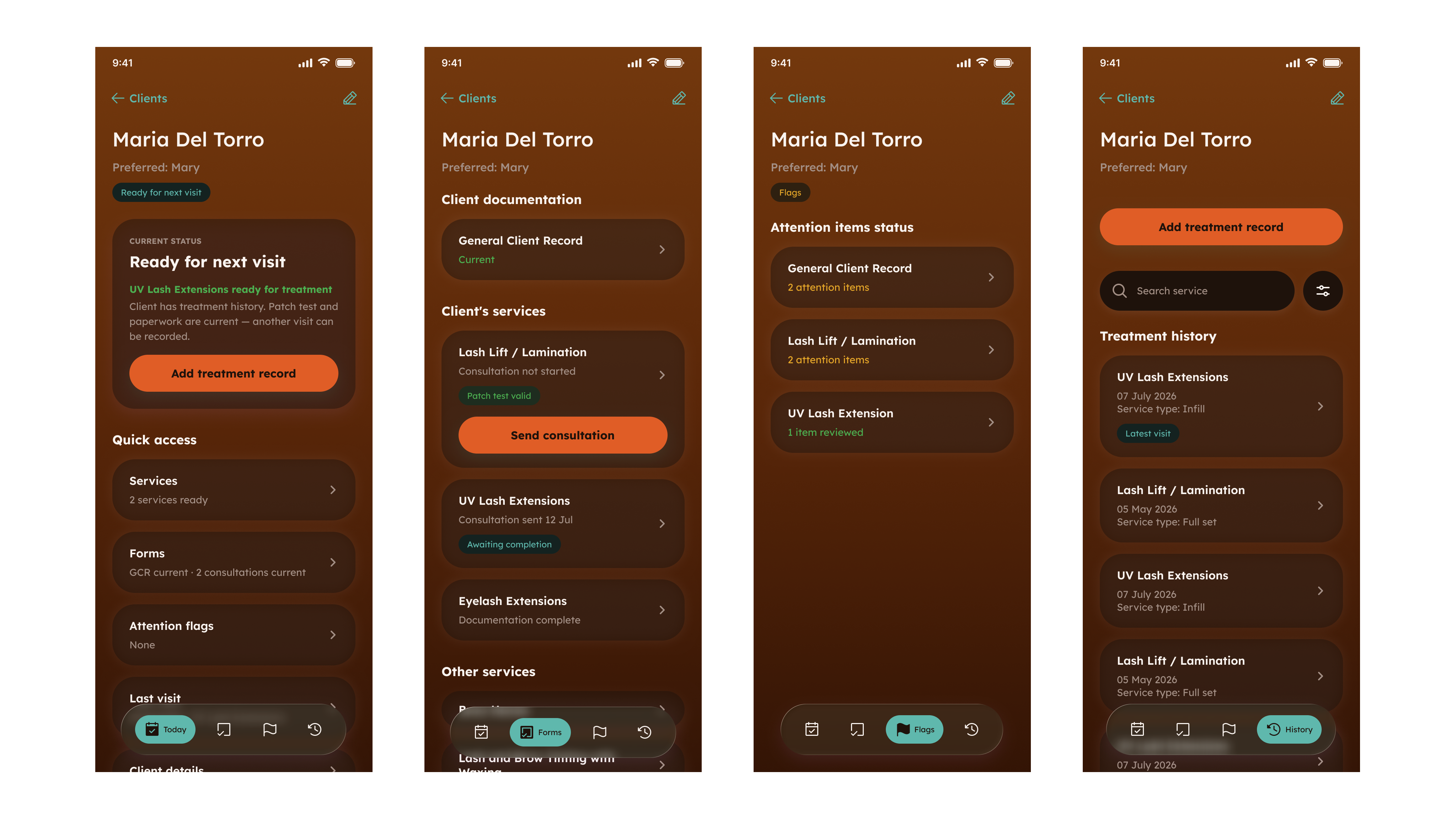
Once eligibility was truthful, the interface had to be too. Each surface got exactly one question to answer, and was not allowed to answer any other.
- Client list
- Which client do I open, and is there one thing that needs attention?
- Today
- What should I do next with this client?
- Forms
- What is the documentation state, and what action does it need?
- Flags
- What needs review before treatment?
- History
- What was done, and when?
The client list carries one operational summary per row, chosen by a deterministic priority: unresolved review, then documentation awaiting completion, then expired documentation for a service the client actually uses, then last visit. One badge carries the category and one line carries the specific reason.
There is no global “Ready” state. A quiet row is the normal case, because “Ready” would be a per-service claim the list has no way to make. Services a client has never had stay silent rather than generating warnings about documentation that was never needed. Otherwise, every profile fills with theoretical gaps and real signals stop being read. And every surface consumes the same resolved state instead of inventing its own, so the list, the profile and the treatment workflow cannot disagree about the same client.
Evidence moves through the workflow
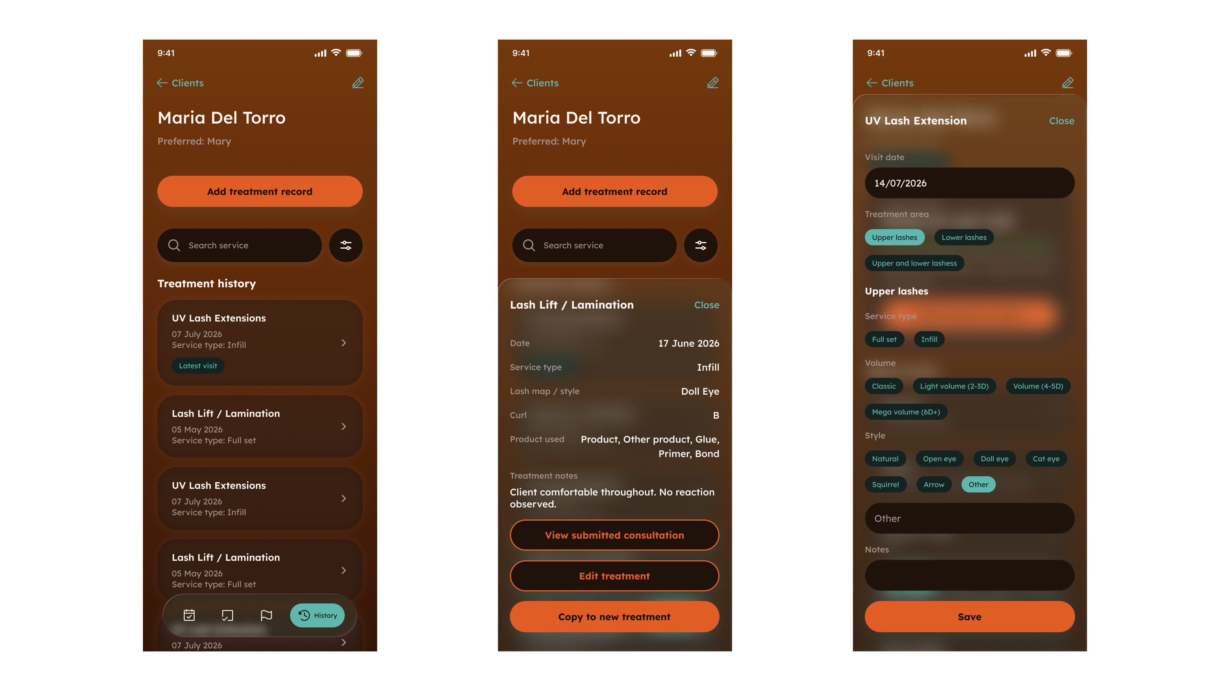
A safety decision is only as good as the evidence attached to it, and re-typed evidence is not evidence. Submitted consultations are immutable: a correction creates new evidence rather than rewriting history, because the question a year later is not what a client says now but what she declared at the time of that treatment. The current profile is derived from the applicable evidence rather than kept as a second editable copy that can drift away from what was signed.
Confirmation is proportionate to the change. Before a treatment the client is asked whether anything has changed; a “no” records a lightweight confirmation and a “yes” creates new signed evidence. Making every visit a full re-completion would have been safer on paper and abandoned in practice. Each treatment then retains the exact evidence it relied on, so history is operational evidence rather than an archive of what happened.
Repeat visits start from the previous record rather than a blank form. Copy Previous carries forward the setup that legitimately repeats, and clears the information that belonged to a specific appointment instead of copying it blindly. Where a service has nothing meaningful to carry forward, the action does not appear at all.
The audit changed the system, not just the bug
Before anyone relied on this product, I put it through a readiness audit against its own safety promises. It returned twenty findings, two of them blocking. The serious one was exactly the class of failure the audit existed to find.
20
findings
2
blockers
8 / 8
services covered after the correction
FINDING
Four services accepted a declared previous adverse reaction and stored it correctly. Nothing in the interface indicated that the answer required review.
ROOT CAUSE
The safety surface recognised question keys from an explicit list, and those four services used names that were never added to it. Two mechanisms shared no vocabulary, so a question could raise a rule and reach no surface anyone looks at.
CORRECTION
Adding four missing names would have fixed the symptom. I treated the disconnection itself as the defect, and made recognition a property the whole model has to satisfy.
PROTECTION
Per-service regression coverage, plus a guard that reads the configured safety rules and fails the build when a rule exists whose answer the flag model would not recognise. The failure class could no longer be reintroduced without the guard detecting it.
A second blocker exposed an unsafe environment boundary, so I separated development and production workflows before real data entered the product.
Evidence contradicted the product model, so I changed the model rather than the screen.
A coherent interface needed a small system behind it
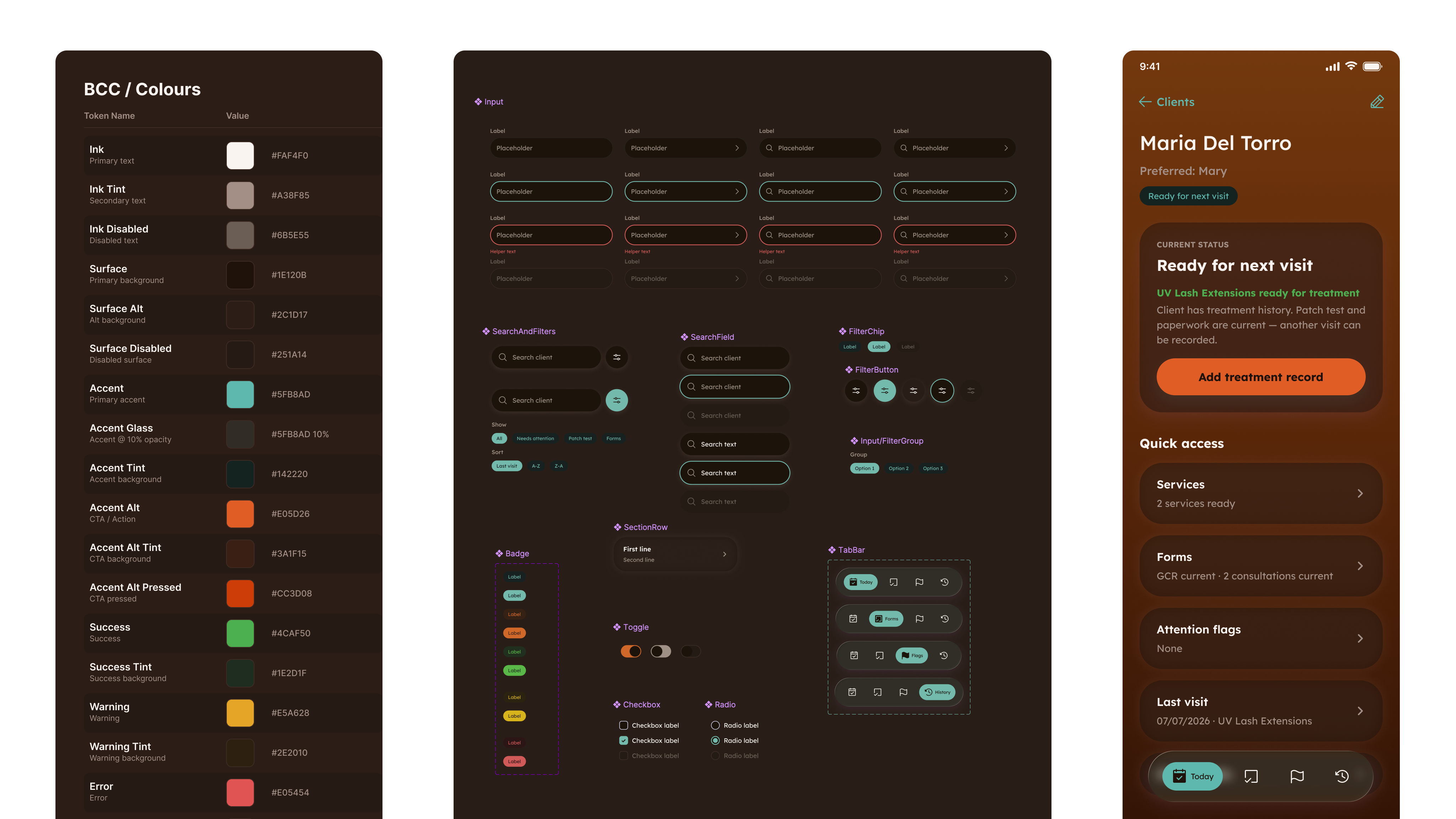
I also built the UI system behind the product: reusable Figma components, design tokens and a corresponding implementation layer covering the states, controls and patterns the workflow needed. The goal was not to create another design-system project. It was to make a product I was evolving quickly remain visually and behaviourally coherent.
I took it into real use
Done did not mean merged. Production releases passed explicit database, access-control and authenticated workflow checks before practitioner acceptance, because the cost of a mistake in an operational tool is not a rollback.
The product moved from validation into controlled practitioner use, on the devices and inside the workflow it was designed for, and it kept evolving after that. New capability has been staged into production deliberately, one piece at a time, with anything whose rules were not yet settled left unavailable rather than shipped and hidden. Recognising a treatment did not mean the product was ready to offer it safely.
AI accelerated delivery. It did not define the product.
AI agents executed much of the implementation inside product boundaries I had already defined: the scope, the rules, the interaction model and the acceptance criteria existed before any agent wrote code. Work was handed over in bounded units, validated against intended behaviour and reviewed before release.
Nothing in that arrangement could redefine a product rule, bypass eligibility, alter signed evidence or make the final treatment decision. The same boundary is built into the product itself: a dictated visit can only become a record marked as needing approval, and the practitioner approves or discards it. Product and release authority stayed human.
AI proposes. The system validates. The practitioner decides.
Interface evidence shown in this case study uses fictional data from the test environment. No production client data is shown.